

Every State's COVID Numbers in Context, August 2021
Every State's COVID Numbers in Context, August 2021
A larger view of COVID data in an attempt to give the best context for understanding a post-vaccine world

The a big change this month in the COVID summary is that my charts have been expanded. Instead of showing the last 4 months of COVID data (which I was doing so we could most clearly see the details of the current COVID situation) I’m now showing state data spanning the past 13 months.
My reasoning is that vaccines change the calculus for everything. We can’t evaluate cases and deaths now without understanding how they moved in the past. Have things changed? How much have they changed? How different are COVID surges from what we saw before? The easiest way to answer this question is to simply show a years worth of data. This way, we can compare what is happening now against what was happening during the largely unvaccinated winter surge as well as get a general idea of when we can expect seasonality to kick back in for a given region.
I’ve also had someone ask for access to the data that I use. The data comes from Johns Hopkins’ state-by-state COVID repository, and I have a set of scripts that pulls the data in and runs some “per population” and “7 day average” calculations on it. I have been holding this information back for paid subscribers, but so few people used it that it seems best to just give everyone access.
Since the beginning of this crisis, I used “10 daily cases per 100K population” as my “Caution Line”. When I started doing this, we were mostly worried about case velocity and cases accelerating into dangerous surges. States that kept cases under that caution line seemed safe. I don’t think that line really means anything anymore other than “we’re in a lull for COVID cases”. I think it is foolishness to set it as a “goal” since the word “goal” implies that it is something that human agency can achieve. But I’m leaving it in there for now for the sake of consistency.
Here is what is going on with COVID this month:
Midwest (Iowa, Illinois, Indiana, Michigan, Minnesota, Missouri, Ohio, Wisconsin)
Mountain States (Colorado, Idaho, Nevada, Utah, Wyoming)
Northeast States (Connecticut, DC, Delaware, Massachusetts, Maryland, New Jersey, New York, Rhode Island, Pennsylvania)
Southern Border (Alabama, Arizona, California, Florida, Louisiana, Mississippi, New Mexico, Texas)
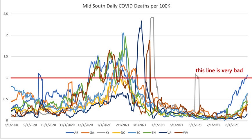
Mid-South (Arkansas, Georgia, Kentucky, North Carolina, South Carolina, Tennessee, Virginia, West Virginia)
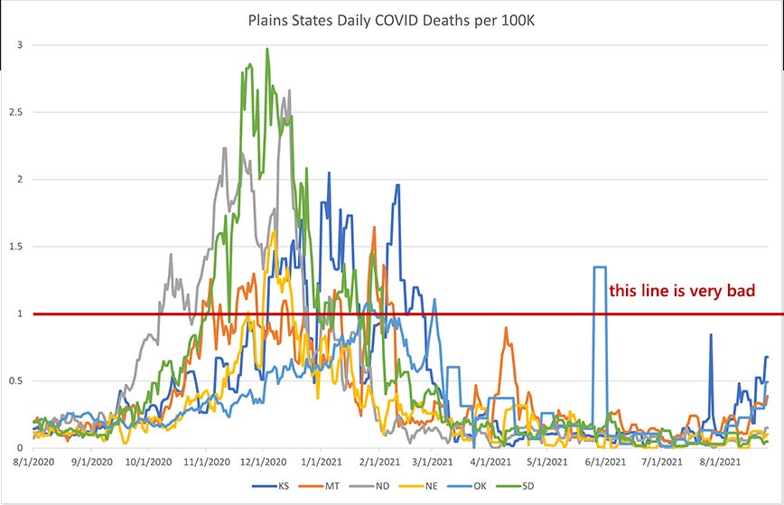
Plain States (Kansas, Montana, North Dakota, Nebraska, Oklahoma, South Dakota)
West Coast (Washington, Oregon, California)
Upper Northeast + Alaska & Hawaii (Vermont, New Hampshire, Maine, Alaska, Hawaii)
Summary
Midwest
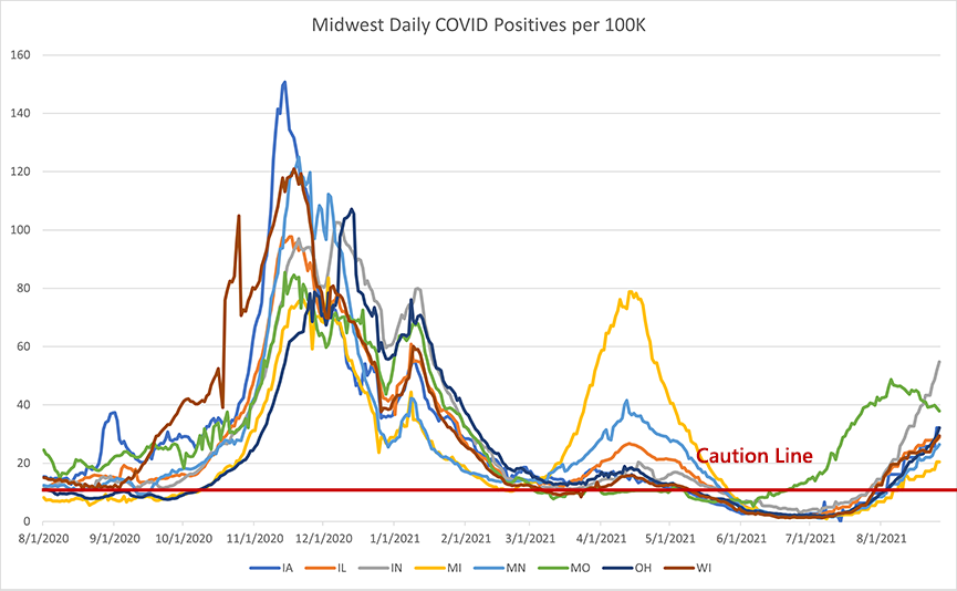
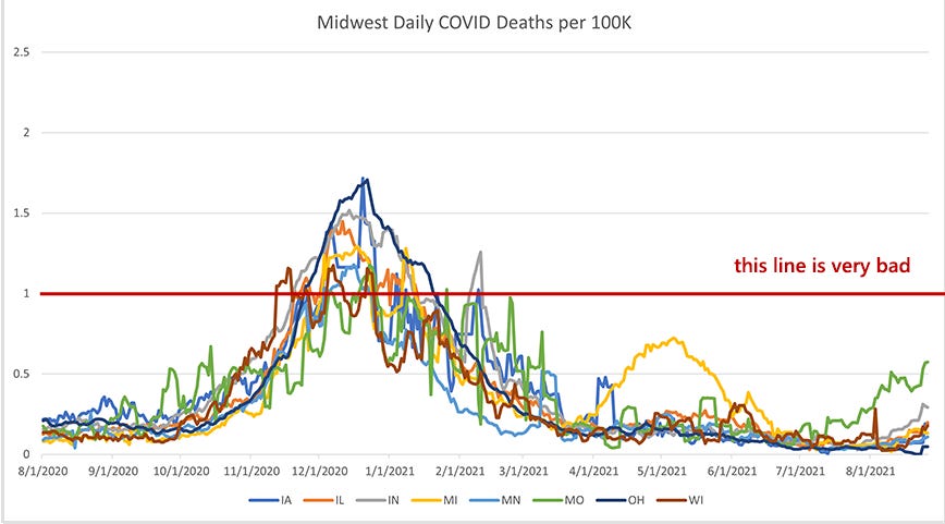
It’s good to see that we’re clearly on the down-side of the surge in Missouri. We’ll expect that to be mirrored in their death rate soon enough. That the death rate bumped up about half as high as during the winter surge is a discouraging sign, given the state’s vaccination status. With nearly 64% of adults vaccinated and rates in the 80% range among seniors (who are most vulnerable), we would have expected to reduce the death rate more than that.
The rest of the midwest seems to be following Missouri about a month behind, starting what could become a surge in the next month or two, with little regard for any “blue state / red state” distinction.
Mountain States
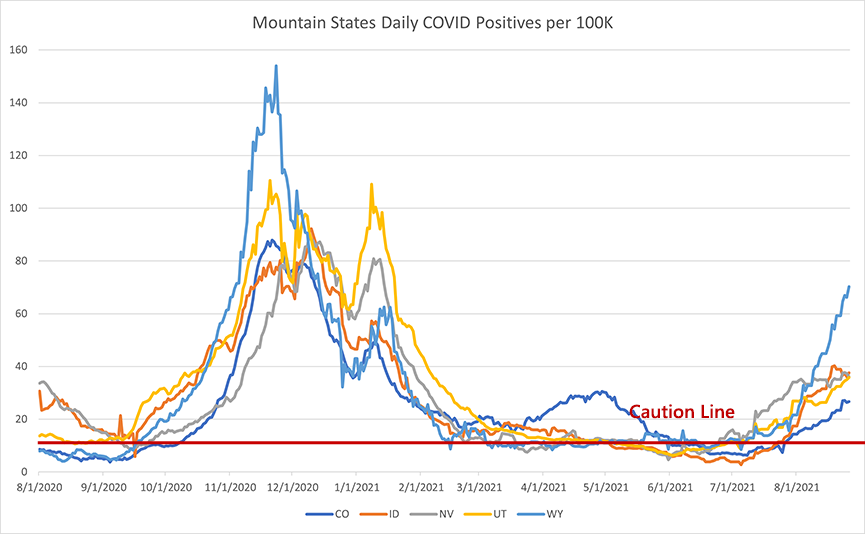
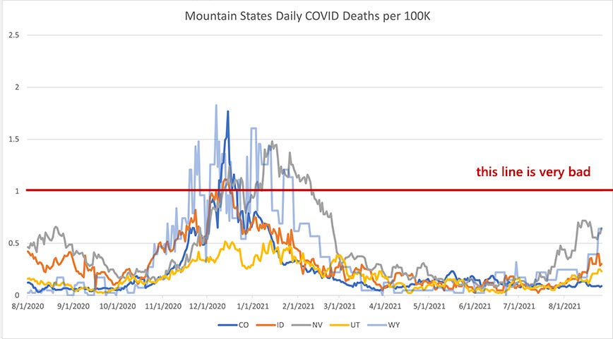
I had to do something weird with Wyoming in the death chart where I made their line transparent. The reason is that Wyoming is such a low population state, their death numbers swing wildly when even 3 or 4 more people die of COVID in a few days. As a result their line obscures the rest of the region, making it difficult to see.
This is another weird one. Nevada’s case numbers don’t look at bad (about in line with Utah and Idaho), but their death rate has spiked much higher than those states, almost as high as Missouri. Why? I have no idea. Their vaccine rates are slightly better than Missouri and they have less of an elderly population. Those are all my ideas for explaining this data and they both fall pretty flat.
Wyoming looks like it is entering a high surge, but the rest of the region is ticking up at a much slower pace.
Northeast
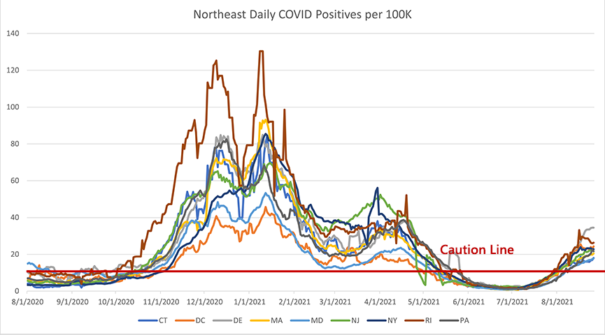

Similar to last year, the northeast had a fairly calm summer. Despite their spring bump in cases, we didn’t see a corresponding bump in deaths. This was one of the things that gave me a great deal of optimism heading into the summer.
Cases are starting to turn up again and much earlier than they did last year. We’re not seeing that reflected in the death numbers and I honestly don’t expect to see much movement in deaths unless cases get above 40-50 per 100K. This is a region that is fairly well vaccinated, but is also fairly old. It will be a good place to watch over the next several months to see if high vaccination rates can make the herd immunity scenario a plausible reality.
Southern Border
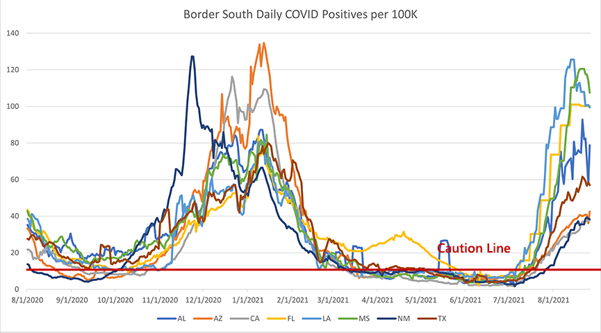
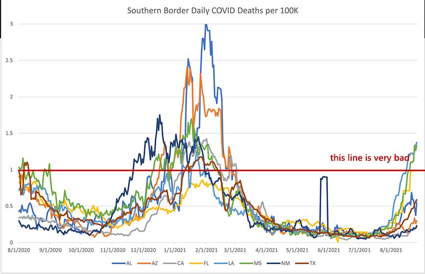
This region has been the tough one. It looks like we’re on the other side of the case surge in the worst hit states (LA, MS, FL, AL). Daily cases went up much higher than I would have expected, even higher than the winter surge. What has been truly surprising is that Florida is substantially more vaccinated than those other states, about 15-20% higher in adult vaccination and up at 95% vaccinated for seniors. That should shrink their pool of COVID-vulnerable individuals massively and reduce their death rate substantially.
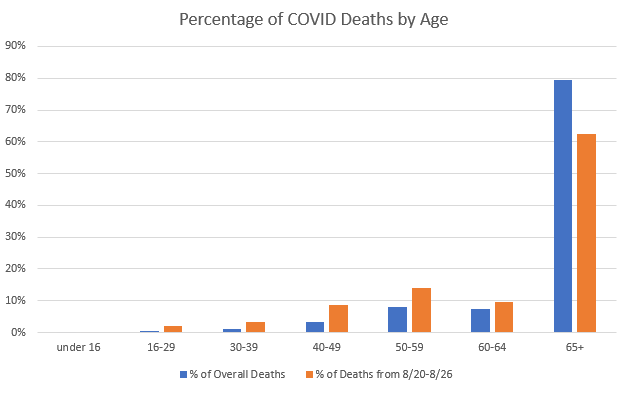
And, while Florida’s death rate is lower than LA and MS, it’s not nearly at the levels we would have hoped or expected. I’m at a loss to explain this. Certain proposals have been tossed around: Florida is an older state, so more of their population is vulnerable. But their vaccination rates (nearly universal coverage among the elderly!) really should suppress this enormously. If a particular age group had +90% vaccination rates, I would expect that group’s COVID deaths to be reduced by at least 70%. Instead, the elderly are still making up the vast majority of COVID deaths in Florida.
I’m going on too long here and I don’t mean to make this only about Florida, but I think Florida is going to help us understand the numbers in other states over the next few months.
Mid South
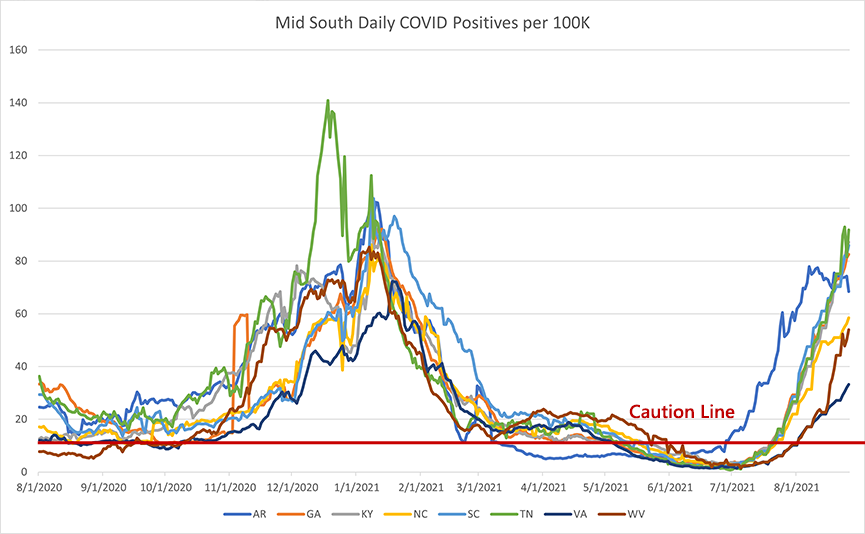
If there is one thing that I feel vindicated about over the last 18 months, it is my observation that COVID surges regionally. Of all the things that have changed, that one has remained the same. Even looking at Arkansas as an early outlier in this region makes sense when you realize that it could be considered part of the same region as Missouri and then you see that they surged in almost an identical pattern.
The rest of the mid south is moving together. TN, GA, SC, and NC are all in the middle of a big spike in cases and I would be astonished if their death rates didn’t follow along by this time next month. The best we can hope for is that the spike peaks quickly and dives back down in the next few weeks.
Plains States
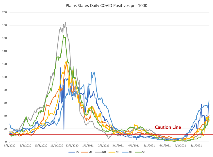
Low population states tend to give really spikey data and we’re seeing that in the plains states. They’re all moving up, but are not yet nearly as high as the southern states. Last year, the spike in these states correlated pretty cleanly with the frigid temperatures of the incoming winter and that is still a few months off.
Death rates are still somewhat low and if the current mini-surge crests soon, they should be able to escape an early surge before the winter hits.
West Coast
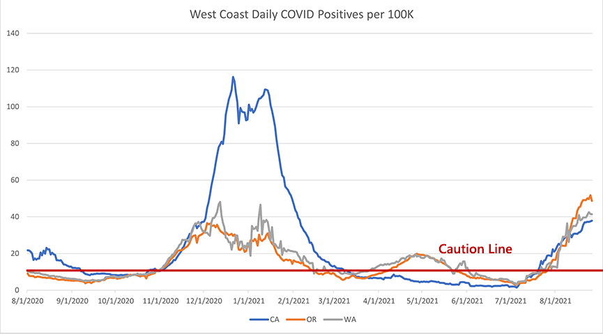
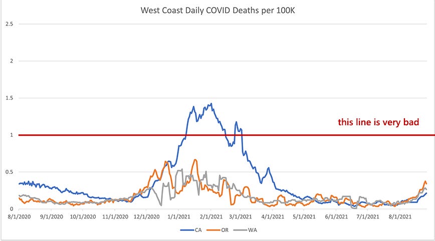
The west coast has largely escaped the worst of the COVID crisis. California had a big and sustained surge in the winter (they were hit substantially harder than Florida in the winter months) but large portions of the west coast have seen sustained periods of low case numbers and low death numbers. The current surge in Oregon and Washington is the steepest and highest we’ve seen in those states, but it still remains a fairly muted surge compared to what most of the rest of the states have seen.
Deaths are rising somewhat, but they aren’t at the winter levels. My sense is that these states are close to their case peaks for this particular wave and that they will sink back down before we get into the winter.
Upper Northeast + Alaska, Hawaii
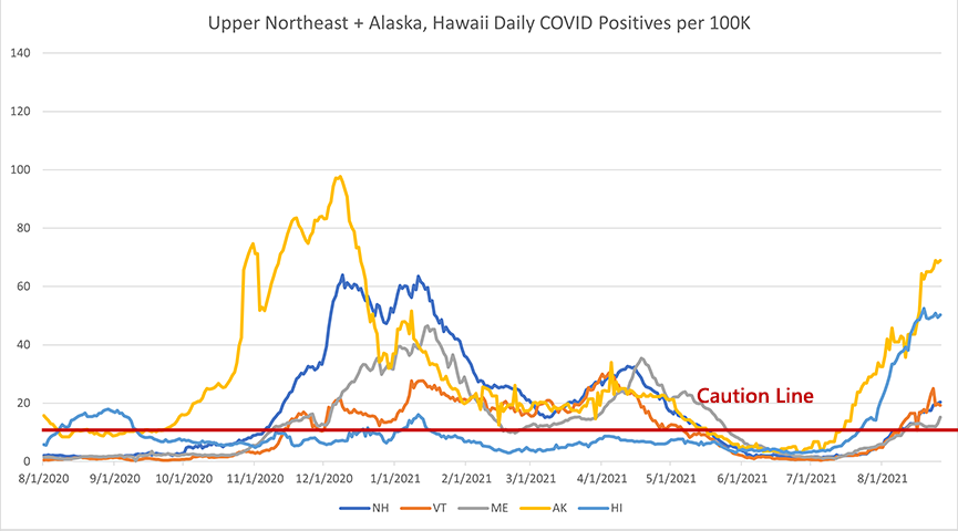
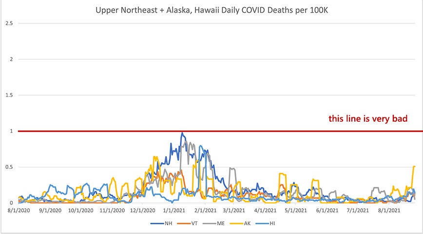
Hawaii is probably our best canary in the coal mine for how a highly vaccinated region deals with COVID. Hawaii has 87.6% of their adult population vaccinated with at least one dose and 99.9% of their senior population, but their COVID rates are still fairly high (currently a little lower than Texas). However, Texas has a death rate that is 3-4X higher than Hawaii. Maybe this is a clearer effect of having a higher vaccination rate and, if so, that would be good news for highly vaccinated regions.
Summary
It seems clear at this point that we are going to see COVID case surges even with high vaccination rates. There really is no way to know if the long-term future looks more like Florida or Hawaii or something in between. The main thing that we’ve learned (or that we should have learned or should be learning) is that we cannot operate society indefinitely in response to the ups and downs of a disease for which we have vaccine protection for the vulnerable. COVID rates cannot be the driving force in our behaviors forever. We should be taking this data and charting a course toward normalcy. Especially for the groups least impacted by the virus.
Looney Tunes: Canned Feud (1951)

This one came recommended to me by a follower who noted my discussion of Rube Goldberg machines in the last issue and suggested this as a follow-up. I had completely forgotten about this gem of a cartoon.
Sylvester’s owners go on vacation and leave him at home for two weeks. He panics, first with the realization that he can’t get out of the house, then with the realization that he has no food, and finally, when he discovers a hoard of canned tuna, with the realization that he has no way to open the cans.
For, you see, the mouse has stolen the can opener and it is Sylvester’s Sisyphean task to either reclaim the can opener or find another method for opening the cans. The gods are sadly aligned against him and it is his sad fate to find failure in every attempt. The cartoonists do an excellent job with Sylvester’s desperation, which really raises the stakes of the drama. This is also a great short for demonstrating the dramatic escalation in these cartoons and how the best ones build and build and build until we get to the final punchline.
Some further context for FL: our population of 65+ is over 4 million. The *entire* population of the state of Connecticut is around 3.5 million. So imagine CT, but the only people that live there are seniors.
There are, to date, about 600,000 unvaccinated seniors left in FL, and if you figure VE of what, a generous 80% (I'm pulling that number out of thin air)for those seniors fully vaccinated (and they were vaccinated early, as Brandon points out below, so effectiveness may be waning), you have about a million old people for the virus to bat around like a cat on catnip.
In short: FL is hard to pattern-match because its elderly population makes it an outlier state.
Two things you didn't address is that a very large proportion of new cases are in unvaccinated people and this variant is more transmissible. Imagine what these curves would look like without the vaccines.
Also the vaccine effectiveness wanes after about 8 months and earlier in the elderly. Israel is seeing the effects of their early and quick vaccination rate.